Combo 
The component presents a description of the change in the application with a graphical highlighting of the change type.
Basic parameters
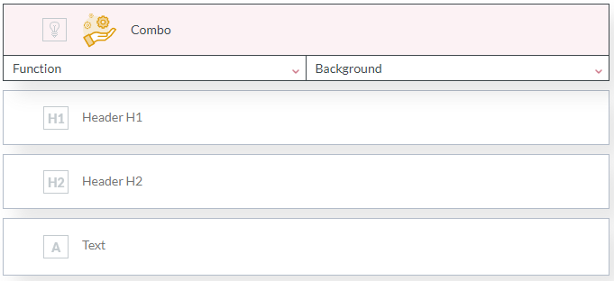
Function - the type of change in the application (e.g., new function, bug fix, etc.). Depending on the selected component function, the component image is automatically changed. Available images depending on the role of the change are shown below:

- Tip!
You can substitute a custom image by setting the Function parameter to Custom.
Background - when inserting other Combo components on the banner, the component's background is set to grey or transparent depending on the previous component's background. Thanks to that, the effect of a list of changes with the alternating color of rows is achieved automatically.
However, you can manually modify the background for each component by setting the Background parameter to Grey or Transparent.
Header H1 - the content of the first header.
Header H2 - the content of the second header.
Text - description of the change in the application.
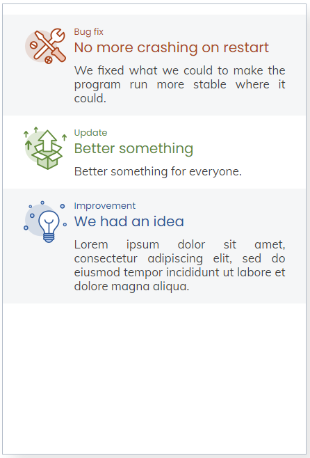
The location of the headers and the change description is shown in the figure below.

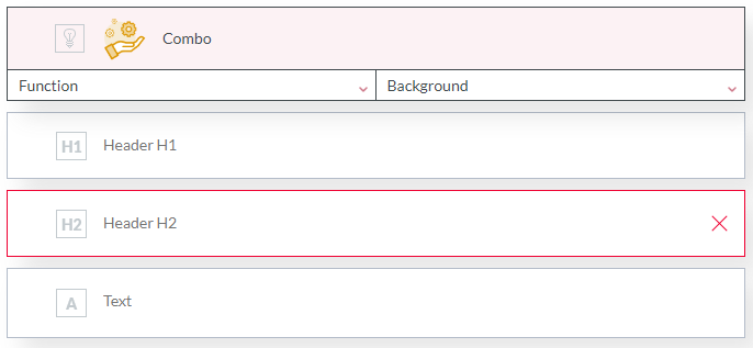
- Tip!
You can delete each line of the change description with a cross at its right edge.
Optional parameters
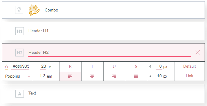
Each line of the change description (headers and body) has its optional parameters.
See the chapter Component optional parameters.
Visualization