
Banner composition
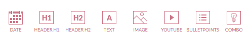
Banner content is composed of content components (components).
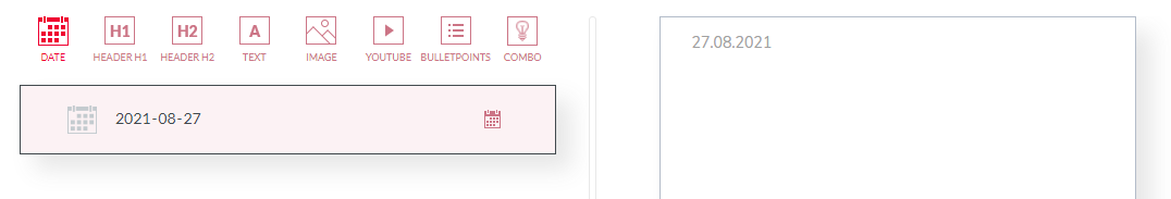
Available components are visible as icons in the upper part of the composition panel.
When a component is clicked, it is inserted into the banner. For example, clicking on the Date component will insert the release date, which you can also observe on the banner preview located on the right side of the channel page
Each component logically fills the whole width of the banner. It is not possible to set two components next to each other. If you have to insert content in the form of columns, this is only possible by embedding the HTML code.
A new component is inserted at the end of the banner and usually requires at least its content to be completed (e.g., if you are inserting a header component, you need to specify the content of that header to be displayed on the banner).
Each component can be moved to a different destination.
You can change many default component parameters such as font color, alignment, etc.
The logic and parameters of each component are described in the Content components section for each component separately.